Map Elements
Reading time
Content
A proper map consists at least of:
- map image,
- title,
- scale,
- legend,
- north arrow,
- imprint.
These are the so-called composition elements and together they form a map layout, also known as a map composition.
We are going to investigate an example map and decompose it into individual elements.
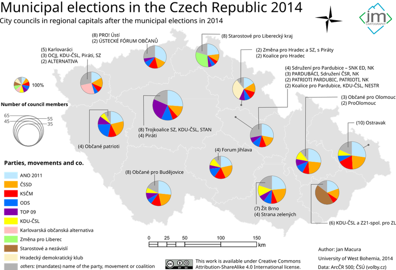
A map with proper composition: Map image, title, scale, legend, imprint and a north arrow.
Map image is the core part of the whole map. It is the spatial data interpreted with a certain cartographic technique to convey an information, a message or a point of view. Yet the map image itself cannot convey any meaningful information on its own. As you can see on the picture below, if the map image is not accompanied with other elements, the content of the map would be a pure guess.
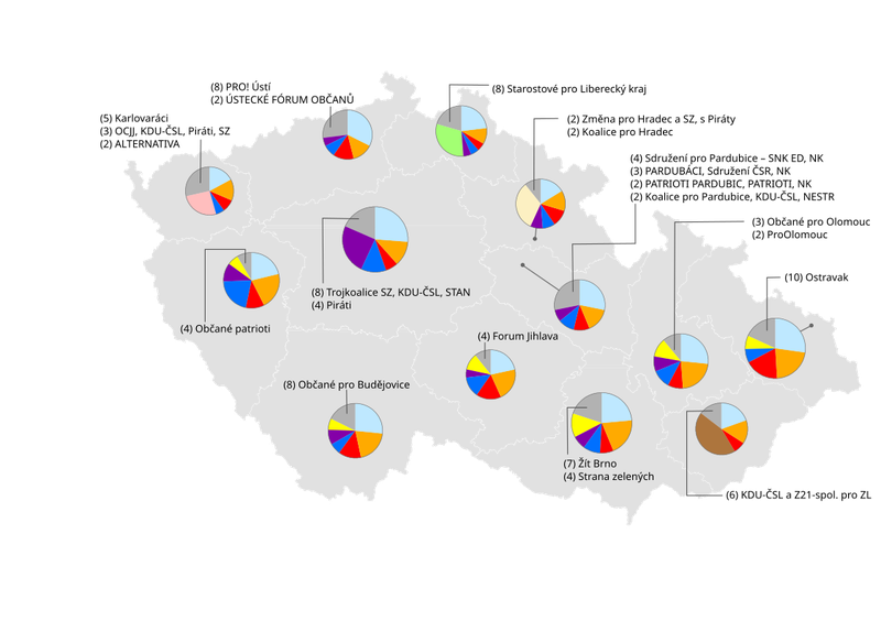
Map image without any other composition elements.
The first element that helps the map reader to understand the content of the map is a title. Title shall be brief but also descriptive and specific. Typically, there is no reason for the map to have the word “map” in its title. A good tile might be e.g. “Crop production in Benin in 2020” or “Trujillo from satellite”, while bad examples might be “Map of crop production” or “What a detail! The image from the sky shows every street of our city. Can you find your house?”.
If the title would be too long, it is a good idea to split the headline, so it is displayed as a title and a subtitle. In such a case, the title gives the reader a coarse idea of what is the topic of the map and the subtitle specifies the topic in a little more detail. In the digital era, maps are often presented as web pages. In such a case, map title can be displayed as a regular page title in the web browser.
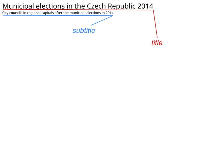
A brief title gives a coarse idea what the topic of the map is. It is further specified in the subtitle.

Interactive digital map presented as a web page with title highlighted.
While a title explains what is displayed in the map, legend explains how it is displayed. Through the charts, textual explanations and map symbols, the reader shall understand all the content visible on the map. With the use of the legend, the reader shall be ultimately able to read the map and to understand it. Usually, there is no good reason to headline a legend with the word “Legend”.
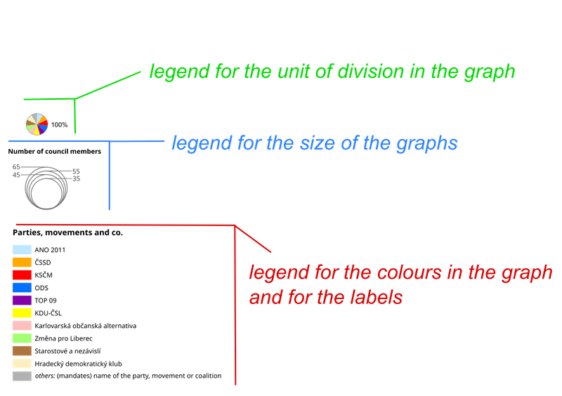
The example map contains three legends as it displays three types of information: a) the ratio of the council seats each party occupies depicted as as fraction of a circle (graph), b) the size of the city council as a number of seats represented as a size of the circle (graph) and c) specific parties represented by their associated colour in the graphs.
Imprint is a brief description of the map’s author, date of creation, source of map’s spatial data, copyright, etc. In the digital world, imprint is usually replaced with metadata records.
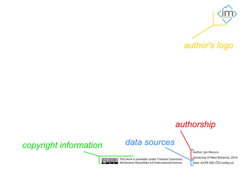
The imprint of the example map is quite generous.
The scale of a map is the ratio of a distance on the map to the corresponding distance on the ground. Scale can be represented as a numeric value (e.g. 1:10 000) or as a graphical scale-bar. Rarely, it can be described using words. Scale and north arrow can be omitted if a geographic graticule is present over the map. Numerical scale is also not appropriate for largely distorted maps (see lecture “Map Projections and Coordinate Systems”).

On the example map, the scale is depicted as a graphical bar.
As mentioned in the lecture “History of Mapping”, the orientation of maps has evolved. Nowadays, we can generally see two orientations:
- to the north or
- to the direction of the viewer.
The former is the most common orientation of printed maps, while the latter is a popular option for digital interactive maps in handheld devices like mobile phones or smart watches. Especially in the case the map is static (printed), a north arrow is an important element, as it helps the reader to orient the map into a direction which corresponds with the world around them. North arrow can be displayed in various shapes from a simple arrow to more complex symbols. It might be accompanied with a letter “N” or the word “north”. Some maps do not contain a north arrow, when they display the whole world or continent, which is expected to be known to any potential reader, especially with the standard orientation having the north on the top. In cases like this, a north arrow is considered redundant.

An example of a north arrow.
Additionally, the map layout can be enriched with other composition elements like images, charts, texts, inset maps, etc.

This map has one additional composition element: an illustration (image / logo) to the topic.
Map image itself usually comprises various elements: labels, annotations, symbols. The set of all symbols, marks and colours used in the map is called a symbology of the map and is explained through the map legend.