Cartographic Visualization Techniques I
Reading time
Content
Cartographic visualization techniques refer to the methods and approaches used to represent geographic data visually on a map. These techniques focus on effectively conveying spatial relationships, patterns and trends through the use of symbols, color schemes and thematic representations.
Cartographic design is centered around creating maps as simplified and scaled-down representations of reality. Since maps reduce the complexity of the real world, their content must also be carefully simplified to ensure clarity and usability. This process involves generalization, which reduces detail by omitting less important features, aggregating similar elements, or simplifying shapes, making the map more readable and focused on its purpose. A critical aspect of cartographic design is the use of symbols, which are graphical representations—such as points, lines, and areas—that stand in for real-world features like cities, roads or forests. Effective cartographic design balances simplicity with accuracy, ensuring the map communicates essential information without overwhelming or misleading the user.
Example of some common symbols used in maps. Yet their meaning can vary in different kinds of maps. Source: maki symbol set.
Thematic maps use symbology—a set of symbols —to communicate their message effectively. For example, a map showing global climates might use color gradients (green for tropical, orange for arid, white for polar zones), while a population density map might use dot density or varying shades of a single color to represent data intensity. A familiar real-world example is the weather map, which uses symbols like sun icons for clear skies or raindrop symbols for precipitation to communicate current conditions clearly.
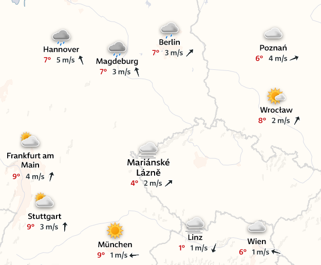
An excerpt from a weather forecast map with various symbols, like cloud or sun, representing expected weather conditions. Source: yr.no
The phenomena represented on thematic maps can be qualitative (describing types or categories, like soil types or land cover) or quantitative (showing measurements or amounts, like rainfall totals or income levels). Symbology is critical for clarity and must align with the type of data. For instance, ordinal data—a subtype of qualitative data with an inherent order, such as "high," "medium," and "low" risk zones—may use progressively darker shades of a color to signify increasing severity. Quantitative data, such as annual rainfall, often uses proportional symbols (e.g. circles sized according to rainfall) or graduated color scales to represent varying data magnitudes.
Visual Variables
A change of a phenomenon value is represented in a map by the change of the symbols properties. For example, in a map showing earthquake magnitudes, earthquake epicentres can be represented using circles, where the size of the circle changes based on the magnitude of the earthquake. A small earthquake might be shown with a small circle, while a large earthquake is represented with a much larger circle. Another example is a population density map, where areas with higher population density might be represented with darker shades of a single colour, while areas with lower density are depicted with lighter shades. These two examples demonstrate the change of symbol size and the change of symbol colour respectively to visualise the change of phenomena value.
The changing symbol’s properties are called visual variables and were described by a French cartographer Jacques Bertin. The core visual variables are:
- Size – can represent phenomena by scaling symbols proportionally to their data values, such as larger circles indicating higher population.
- Shape – can represent phenomena in thematic maps by varying the form of symbols to distinguish categories, such as triangles for mountains, circles for cities and squares for industrial zones.
- Colour hue – can represent phenomena in thematic maps by using different hues to distinguish categories, such as yellow for wheat fields, green for orchards and violet for lavender fields.
- Colour lightness – can represent phenomena in thematic maps by varying the brightness of a colour to indicate data intensity, such as lighter shades representing lower population density and darker shades representing higher density.
- Colour saturation – can represent phenomena in thematic maps by using more saturated colours to indicate higher values of a variable, such as dark green for areas with high rainfall and lighter green for areas with lower rainfall.
- Orientation – can represent phenomena in thematic maps by varying the angle or direction of symbols to indicate different categories or trends, such as vertical lines for urban areas and horizontal lines for agricultural zones.
- Pattern/Texture – can represent phenomena in thematic maps by using different patterns to distinguish categories or data ranges, such as solid fill for agricultural areas and crosshatch patterns for industrial zones.
- Height – can represent phenomena in thematic maps by varying the elevation of symbols to indicate data values, such as taller bars representing areas with higher GDP and shorter bars representing areas with lower GDP.
Colour hue, colour saturation, and colour brightness are all aspects of colour that influence how we perceive it. In brief: colour hue defines the actual colour (red, blue, etc.), saturation describes the intensity or vividness of the colour and brightness refers to how light or dark the colour appears.
In digital, animated, haptic (for visually impaired users) or other maps, additional non-visual variables can be used for the same purpose. These variables include, but are not limited to:
- Duration – can represent phenomena by adjusting how long a symbol or feature appears or remains highlighted, such as using flashing points to indicate the length of time an event (e.g. a road closure or natural disaster) affects a location.
- Pressure – can represent phenomena by varying the force required to interact with the map interface, such as increasing resistance to indicate elevation or density at specific locations.
- Vibration – can be used in a haptic map to convey information by triggering specific vibration patterns when a user touches certain areas of the map, such as indicating land types, hazard zones, or proximity to a point of interest.
- Friction – can represent phenomena in a haptic map by changing the resistance felt when interacting with specific areas, such as increasing friction to indicate rough terrain or restricted zones.
- Loudness – can represent phenomena by adjusting the volume of auditory feedback to indicate intensity, such as louder sounds for higher population density or stronger weather conditions.
Choropleth and Chorochromatic Maps
Choropleth maps and chorochromatic maps are often considered one category of thematic maps, but they differ in one key aspect. While both types of maps use colour to convey information, choropleth maps specifically deal with numerical data, whereas chorochromatic maps deal with categorical data. This overlap in the use of colour for mapping can lead to misunderstanding the types of data being represented.
Chorochromatic maps use different colours (colour hues) to represent qualitative variables, such as land use types, political boundaries or cultural regions, where each colour corresponds to a distinct category. Areas depicted in chorochromatic maps can be determined by socio-economic factors (commonly administrative units) or by physical-geographic phenomena (geological maps, geomorphological maps, botanical regions, altitudinal zonation, …). In the course “Mapping Fundamentals”, a geological map of Britain by William Smith was mentioned, which is an example of a chorochromatic map with physical-geographic boundaries. A common example of a chorochromatic map with administrative boundaries are political maps. In chorochromatic maps, the cartographer has to deal with the limitation that any two adjacent areas must have distinct colours to clearly differentiate the qualitative categories they represent. There are online tools like ColorBrewer by Cynthia Brewer which helps create colour palettes for chorochromatic and choropleth maps.
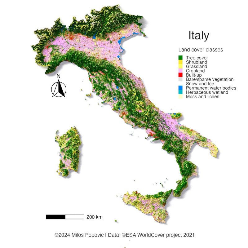
Chorochromatic map showing land cover of Italy divided into 10 distinct categories. The 3D visual effect is adding additional information about elevation on one hand, but it can cause colour misinterpretation on the other hand. Source: Milos Popovic, 2024, via LinkedIn.
Choropleth maps use varying shades (colour saturation) or colours (colour brightness) to represent the distribution of a quantitative variable across geographic areas, with darker or more intense colours typically indicating higher values and lighter colours representing lower values, such as population density or income levels. In the course “Mapping Fundamentals”, statistical maps by Pierre Charles Francois Dupin were mentioned, which are great examples of choropleth maps.
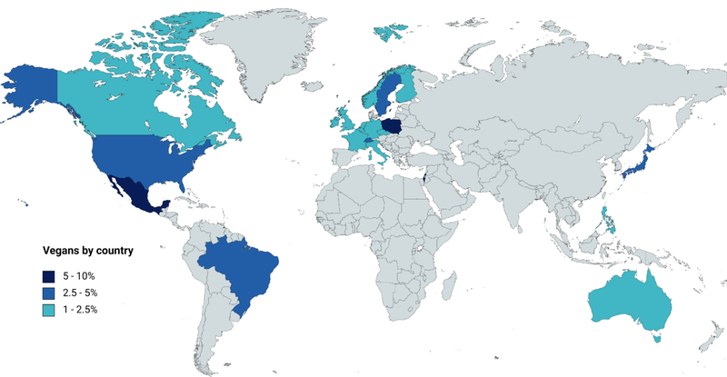
Choropleth map of the world visualising a percentage of population that claims to be vegan. The message this map could convey is limited by the many countries with missing data. Source: Radom1967 / CC BY-SA 4.0
Labeling and Annotation Techniques
In cartography, a label is a textual annotation placed on a map to provide additional information about a geographic feature, such as the name of a place, a landmark, or a specific data value. Labels help to clarify the identity or significance of features and are typically positioned near or on the feature they describe. Description and other text data are created and placed on the map only in the final stage of map creation. There are some basic rules for using labels on maps:
- More significant elements are displayed graphically with a more prominent description.
- The descriptive component of the map must be authentic and linguistically correct.
- Standardised names are used.
Placing the labels correctly on a map is crucial: The labels must not mutually overlap, labels cannot overlap map symbols (or vice versa) and there must be a clear distinction between the label and the map symbols (letter O vs. circle marker, letter I vs. vertical lines etc.). Ensuring this involves strategically placing text labels, removing redundant information, adjusting font sizes and ensuring that labels do not overlap or obstruct important map features. The goal is to create a balanced map where the text enhances the understanding of the map without overwhelming the viewer. The process of reducing unnecessary or excessive labels and annotations to improve the map's readability and visual clarity is called decluttering.
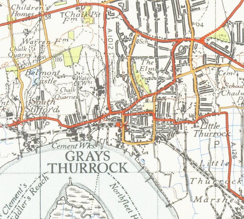
The one inch to the mile scale topographic map by Ordnance Survey from 1946 with carefully placed labels of places.
Sources
Source for this chapter: ČERBA, Otakar. Texty na mapách. Department of Geomatics, University of West Bohemia in Pilsen. 2018, CC-BY-NC-SA.
Creating map symbology in QGIS
QGIS provides many ways to modify the symbology of layers, which can be performed by various workflows. One way to access the layer’s symbology is opening the Layer Styling panel. Another option is to work with the “Symbology” tab from the layer’s Properties.
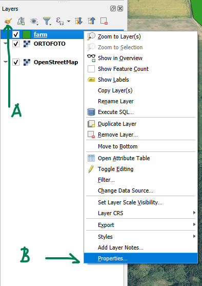
A button to open the Layer Styling panel (A) and a location of the layer's Properties window (B).
For raster layers, the “Symbology” tab offers only a limited set of options like adjusting the brightness of the image, or setting the resampling method. For these layers, there is an additional tab “Transparency”, for setting the layer’s transparency (opacity).
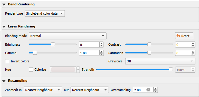
“Symbology” tab for a raster layer.
For vector layers, the “Symbology” tab offers a very wide variety of options. Points, lines and polygons can be displayed in a single colour, which is the simplest case, but individual polygons can also have different colours based on the values from the attribute table. The styling options include categorized symbols, graduated colours, rule-based styling etc. Pre-defined styles can be selected from the project’s defaults or custom symbols can be tailored via composing markers (for points layers), line styles (for lines) and fills (for polygons) together.
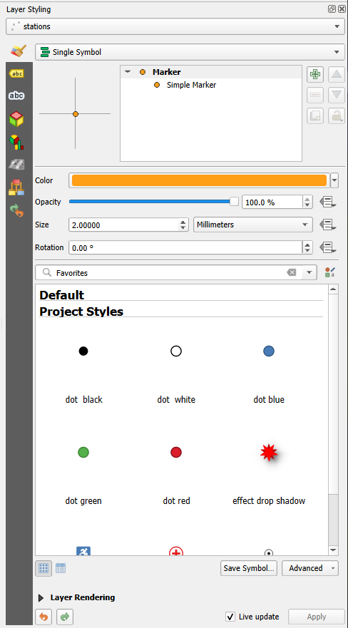
Layers Styling panel of a point layer. The features are symbolised with a simple (circle) marker in a single (orange) colour.
Beside the symbols, labels can be also defined for vector layers. These can be based on a single attribute from the attribute table or composed from multiple attributes based on a set of rules. Many options for the text styling and label placement are also available.
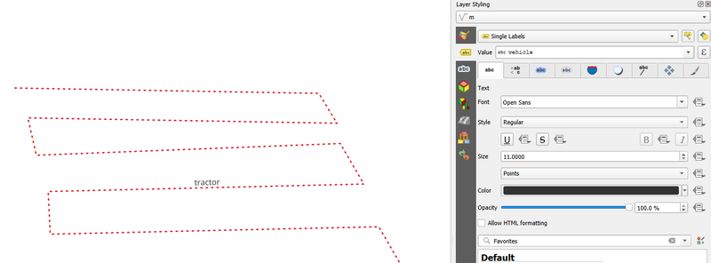
A vector (line) layer with labelling set in Layer Styling panel to “Single Labels”, showing the name of the vehicle along its path, and how it is displayed in the map canvas.