Cartographic Visualization Techniques II
Reading time
Content
Generalisation Rules
Generalisation in cartography relates not only to the creation of map symbols themselves, but it means a whole process of simplifying or reducing the detail of geographic features, in order to make the map more legible and easier to understand. The whole world doesn't really fit on paper or screen. We just have to choose the important elements – important not to the map creator, but to whoever reads the map.
Common generalisation techniques include:
- Simplification: Reducing the complexity of shapes, such as smoothing jagged coastlines or straightening curved roads, to make them easier to interpret.
- Aggregation: Combining smaller features into larger ones, like grouping individual buildings into a single building block or merging small rivers into a larger waterbody.
- Selection: Omitting less important or smaller features, such as removing minor roads or small streams, to focus attention on more significant elements.
- Exaggeration: Increasing the size or prominence of features to enhance visibility, such as making a major river wider to make it stand out on a map.
- Displacement: Moving map features slightly to prevent overlap or improve readability, such as relocating labels or symbols to avoid clashing with other elements.
- Categorisation: Grouping features into categories or classes, such as grouping areas into different land-use types or population ranges and then representing them with a uniform symbol or colour.
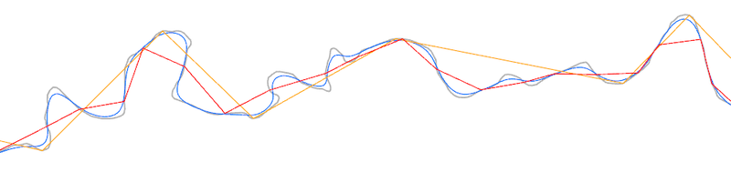
Original line in grey colour. Blue, red and orange lines are results of different line simplification algorithms. Source: Bplewe / CC BY-SA 4.0
Proportional Symbol Maps
We have already described choropleth maps, where geographic areas are filled with colours of varying intensity or shading or with varying hatch patterns to represent values of a quantitative spatial data. Proportional symbols maps use differently sized symbols (points or lines) at specific locations to represent the magnitude of data tied to the related points, lines or areas. In the course “Mapping Fundamentals”, Charles Joseph Minard’s map of Napoleon’s march against Russia was mentioned, which is a great example of proportional lines map.
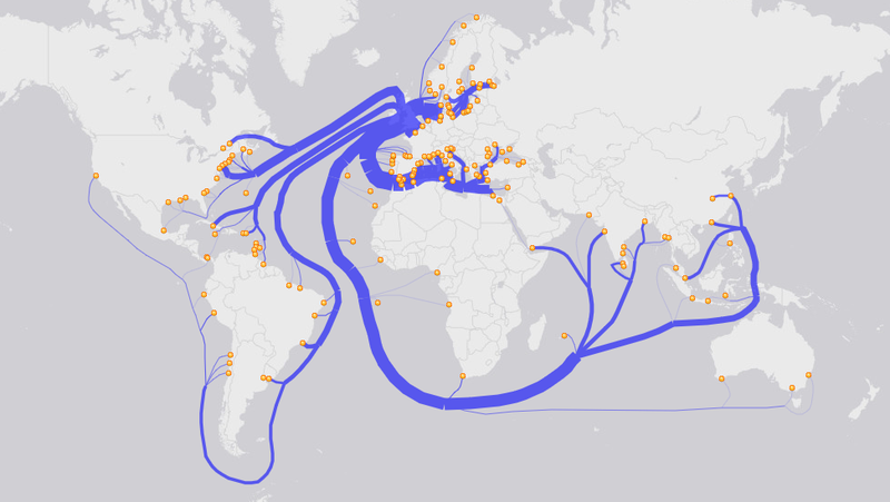
Proportional lines map, also known as flow map, showing English Coal Exports in 1864. Source: https://gisgeography.com/flow-maps/
A graduated symbols map is a form or proportional symbols map that represents quantitative data using symbols (such as circles, squares or other shapes) of different sizes. In contrast to proportional points map, in graduated symbols map, the sizes of symbols are grouped into discrete classes rather than scaled proportionally. Each class corresponds to a range of data values, and symbols of the same size represent values within the same range. For example, a graduated symbols map might use small, medium, and large circles to represent cities with low, medium, and high populations, respectively. This approach simplifies interpretation while still conveying relative differences in data.

Submarine cables differentiated by colour based on their age. A variant of a map with graduated lines (although the lines are varying in colour instead of thickness). Source: Wendy Shijia Wang, 2021, https://wendyshijia.notion.site/Wendy-Shijia-s-Dataviz-Archive-6eea22aa2ca44198a06f329724204591
Both proportional symbols and graduated symbols maps are great to communicate a single quantitative variable. Chart maps integrate multiple data dimensions into a single visual representation in the form of charts, such as pie charts, bar charts or other graphical representations known from statistics. These maps visually communicate complex datasets by presenting proportions, comparisons, or distributions of multiple variables directly on the map. For example, a chart map might use pie charts at city locations to show the relative proportions of energy sources (e.g. coal, solar, wind) used in each area, or bar graphs to depict annual rainfall totals over several years.
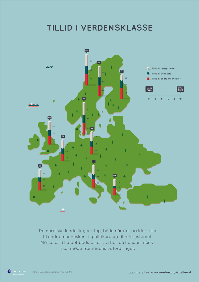
Map of Europe with bar charts on selected countries displaying the ratio of trust among the society. It is divided into trust in justice, trust in politics and trust in the other people. Source: Ferdio, https://www.ferdio.com/en/nordic
Dot Maps
In the course “Fundamentals of Spatial Data Acquisition and Mapping”, John Snow’s cholera outbreak map with dots was mentioned as setting the basis for modern epidemiology. Dot maps are a type of thematic map that uses dots to represent the spatial distribution of a variable, with each dot corresponding to a specific quantity of the data being mapped. One dot can represent one piece of the depicted phenomena, but it can also be valued as 10, 1 thousand, 1 million or any ratio of pieces. Dot maps are particularly effective for showing density or concentration, such as population distribution, agricultural production, or the location of specific events. The placement of dots can be either exact, reflecting precise locations of data points, or approximate, spread across an area to represent aggregate data. Dot maps differ from other thematic maps, like choropleth maps, by emphasising individual occurrences or distributions rather than summarising data over predefined regions, offering a more granular and visually intuitive representation of patterns.
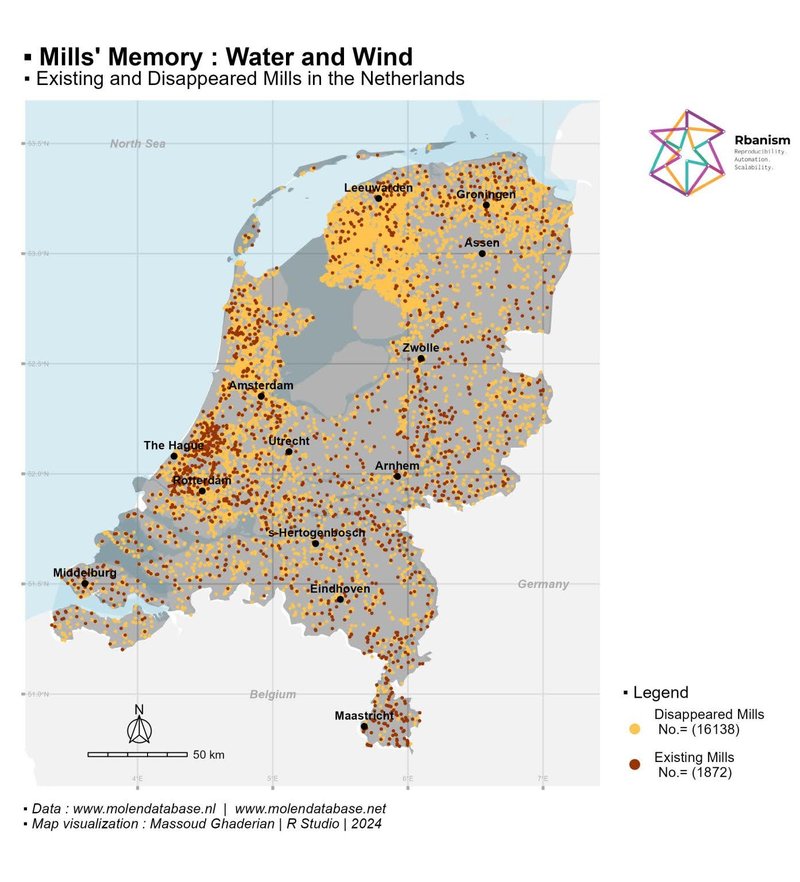
A map of the Netherlands showing windmills and watermills. The colour distinguishes if the mill still exists or if it has already vanished. Each mill is represented with a single dot. Source: Massoud Ghaderian, 2024, via LinkedIn
Cartograms
Until now, all cartographic visualisation techniques described were respecting the boundaries of geographic shapes in which the phenomenon is depicted. This is not the case in the cartogram method. A cartogram is a type of thematic map in which the size of geographic areas is distorted or reshaped to represent a specific variable, rather than reflecting their actual geographic size. The distortion is proportional to the data being represented, such as population, income or election results. Cartograms help to highlight the relationship between spatial distribution and the variable being mapped, often providing a more intuitive understanding of the data.
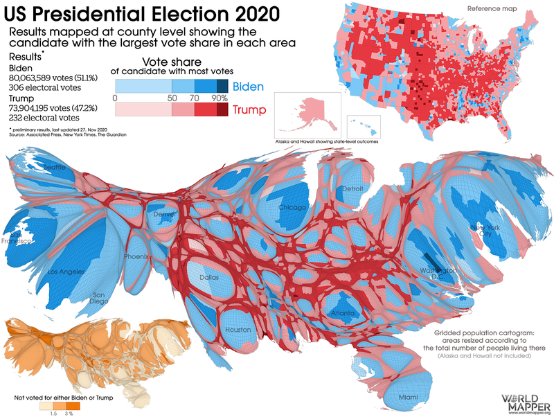
Comparison of US Presidential elections 2020 depicted by different visualisation methods. Top right – traditional choropleth map with county level data, middle – cartogram with radial distortion and area size proportional to population of the state. Source: https://worldmapper.org/us-presidential-election-2020/
Common Cartographic Mistakes
Creating accurate and effective maps requires a balance of technical skill, attention to detail, and a clear understanding of cartographic principles. However, map makers—not only those with limited experience or training—often make errors that can distort or misrepresent the data being presented. These mistakes, whether intentional or unintentional, can lead to confusion, misinterpretation, or even manipulation of information, undermining the map’s purpose. A great publication about common cartographic mistakes is How to Lie With Maps by Mark Monmonier. Frequent mistakes done by map makers include but are not limited to:
- Excessive use of colours: Using too many colours or choosing colours that are not intuitively associated with the data, leading to confusion.
- Inappropriate colour gradients: Applying a gradient scale that does not align logically with the data (e.g. using red to represent low values and green for high values in a context where red indicates danger).
- Improper use of proportional symbols: Using symbols that are not accurately scaled to the data values or exaggerating size differences.
- Arbitrary classification breaks: Choosing arbitrary or unequal class intervals for data in choropleth maps, which can skew perceptions of the data.
- Lack of a legend: Failing to include a clear and accurate legend, leaving the viewer unable to interpret the symbols, colours or scales.
- Overcomplicating the map: Including too much data or unnecessary layers, overwhelming the user and obscuring the main message.
- Simplifying too much: Removing critical details or context, which can mislead viewers about the nature of the data.
- Distorting areas with inappropriate projections: Using map projections that distort size or shape, such as Mercator for area-based analyses, without addressing the distortion's impact.
- Unequal spatial units: Comparing data across regions of vastly different sizes without normalising the data (e.g. population counts instead of density).
- Cherry-picking data: Selecting data that supports a particular narrative while ignoring contradictory information.
- Misleading symbology: Deliberately using colours, symbols or scales to overemphasise or understate specific areas or trends.
- Using outdated or inaccurate data: Displaying information that is no longer relevant or has errors.
- Ignoring data source credibility: Failing to use reputable sources or verify data accuracy.
Creating Thematic Maps in QGIS
Refer to chapter Cartographic Visualization Techniques I to understand how a symbology of a layer can be adjusted in QGIS.
Layer Styling panel in QGIS is very suitable for preparation of a thematic map. Yet having the appropriate data to an intended purpose is crucial. If the geodata does not include the necessary information in its attribute table or if the attributes are not in a usable form, it will be likely impossible to create a desired map or the map will convey a misleading message.
When a vector layer with polygons is present and the layer has an attribute which is quantitative, then such a map layer is ideal to represent as a choropleth map. A quantitative attribute can be an amount of spray applied, number of livestock on pasture or a yield of a field. First, it is very important to verify that the values in the attribute column are relative to the size of the polygons. If the values are not relative, they need to be normalised first. Normalised values are “spray applied per square metre”, “livestock per acre” or “yield per hectare”. The calculation of normalised values can be done by dividing the absolute value by the area of the polygon. The normalised value is usually saved as a new attribute column. Displaying absolute values would be misleading as larger areas usually hold larger amounts of the phenomena (crop, livestock, etc.).
A polygon layer with a normalised quantitative attribute can be styled as a choropleth map in the Layer Styling panel in QGIS. In the panel, the symbology must be changed from “Single Symbol” to “Graduated”. Then the attribute column and an adequate color ramp must be selected. When the attribute column is classified, the colour of polygons in the map shall change. Sometimes it is also beneficial to change the classification method (Pretty Breaks, Equal Interval, Standard Deviation, etc.) or the number of classes to create, depending on the actual values of the data.
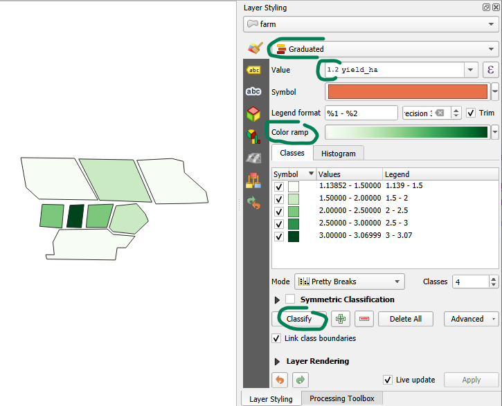
Creating a choropleth map with “Graduated” symbols based on the attribute column “yield_ha”, classified into 5 classes, each with a distinct shade of green.